For the first time in nearly a decade, Google has updated its iconic “G” logo — and it’s not going unnoticed. The quiet redesign, which began rolling out on 12 May, swaps the once-bold colour blocks in the letter for a sleek, modern gradient effect.
Currently visible on the Google Search app for iOS and included in the 16.18 beta update for Android, the refreshed icon hints at a possible broader rebranding effort. However, as of Monday, the change has yet to extend to other parts of Google’s visual identity.
While the company has remained silent on whether this new design will ripple across more of its branding, the timing is sparking speculation. The update comes just days before Google I/O 2025, its annual developer conference set to kick off on 20 May.
This marks the first major tweak since 2015, when Google swapped its lowercase white “g” on a blue background for the multicolour block-style “G” and adopted the Product Sans typeface for its wordmark. Back then, the redesign was meant to reflect a shift from desktop-first browsing to a world of multi-device experiences.
“As you’ll see, we’ve taken the Google logo and branding, which were originally built for a single desktop browser page, and updated them for a world of seamless computing across an endless number of devices and different kinds of inputs,” the company said in its 2015 blog post.
The evolution of Google’s logo has always balanced simplicity with tech-forward aesthetics. “The earlier fonts evoked the traditions of the past while also being forward-looking,” said Ruth Kedar, designer of the original Google logo, in a 2023 company interview.
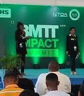
- FG Plans 3MTT Summit to Showcase Emerging Digital Talent

- Tech Experts Urge Creatives to Adopt AI for Sustainability
- Event Review: Inside GigConnect 2025, A True Freelancers Party
- Nigeria Races to Protect Children from Online Threats with Child Online Safety Bill
- Nigeria’s Crypto Boom Needs Rules to Weed Out Scams, Says Quidax Expert
- Ibadan Tech Expo 2025: AI Engineer Maryam Muritadha Honoured for Innovation and Impact


I am passionate about crafting stories, vibing to good music (and making some too), debating Nigeria’s political future like it’s the World Cup, and finding the perfect quiet spot to work and unwind.


One reply on “Google Unveils Subtle ‘G’ Icon Makeover Before I/O 2025”
[…] Google has launched a new premium plan called AI Ultra during the Google I/O 2025 event. The subscription costs $249.99 per month and is designed for creative professionals like filmmakers, developers, and content creators. New users can get a 50% discount for the first three months. […]